
The first chart shows population density in the St. John's area by census tract (from the 2011 census). The darker the colour, the more dense the population (click on the image to see the legend).
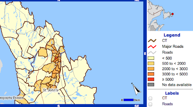 |
| Population Density - residents per square km |
Next we see the percent change of population between 2006 and 2011. Dark red means the population is growing quickly. The palest colour is where the population is shrinking.
 |
| Percent change in population between 2006 and 2011 |
With the exception of Georgetown and Bannerman Park, the population actually shrank in central St. John's. The big growth is happening in the suburbs and in the satellite communities of Torbay, Paradise, and CBS. People are spreading out.
Source: Statscan Geosearch
No comments:
Post a Comment